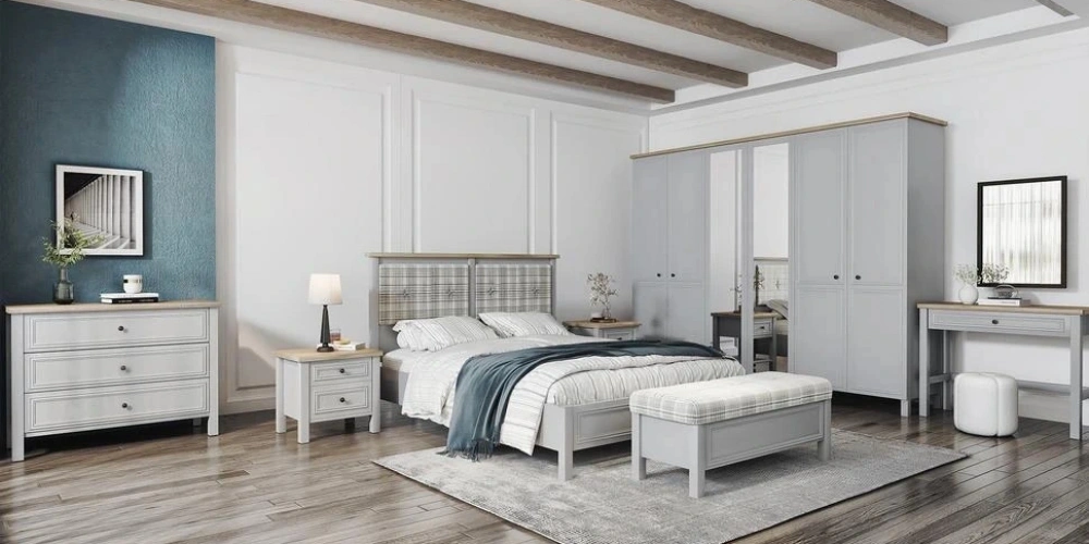
The bedroom is one of the most special areas where we relieve the fatigue of the day, rest, and mentally rejuvenate. Therefore, the colors used in this room have a significant impact not only on physical comfort but also on mental balance. Colors carry important psychological messages as well as aesthetic ones; some provide calming effects while others can boost energy.
When choosing colors, one should pay attention not only to taste but also to the meanings and emotional impacts of colors. Factors like sleep quality, stress level, and morning energy are greatly influenced by the color tones in the environment.
So, which colors should be preferred in the bedroom? Which tones bring peace, and which should be avoided? In this article, you will discover the answers to all these questions along with their psychological effects.
Why Is Color Selection Important in Bedroom Decoration?
Colors greatly affect the atmosphere of a room. Especially in resting areas like the bedroom, the right color preferences ensure a better quality sleep and a peaceful mood. Wrong color choices can unknowingly create discomfort, stress, or low energy.
The tones used in decoration can evoke different emotions when combined with the room's lighting. For example, warm tones make the space feel intimate and cozy, while cool tones create a sense of freshness and calmness. This effect directly impacts psychological state and indirectly reflects on quality of life.
Additionally, the color preferred in the bedroom can also affect the mood you feel when you wake up in the morning. To make a positive and fresh start to the day, soft and neutral tones should be preferred. Colors that do not strain the eyes and calm the mind support starting the day peacefully.
The size of the room should also be considered when choosing colors. In small rooms, the sense of spaciousness can be increased by choosing light colors. In large rooms, depth can be added with dark tones.
In short, color selection in the bedroom is not just a decorative decision but also a means of mental and emotional balance. Therefore, conscious choices should be made from both aesthetic and psychological perspectives.
Which Colors Create a Feeling of Peace and Relaxation in the Bedroom?

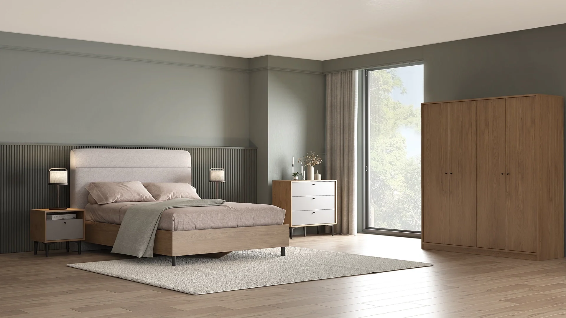
If you want to create an atmosphere of peace in the bedroom, taking inspiration from the tones of nature is the right way to go. Soft and neutral colors calm the mind and make it easier to fall asleep. These tones also make spending time in the room more enjoyable.
Blue stands out for its calming effect. Especially light blue tones slow down the heart rate and create a sense of calmness. It is a very ideal choice for those who have sleep problems.
Green, another color associated with nature, provides a sense of peace. Olive, sage, or pastel greens offer visual refreshment and a feeling of renewal. Especially in rooms with natural light, green tones are much more effective.
Lavender and
pastel purple are tones that provide both elegance and spiritual balance. When applied without excess, they create a sense of elegance and emotional softness.
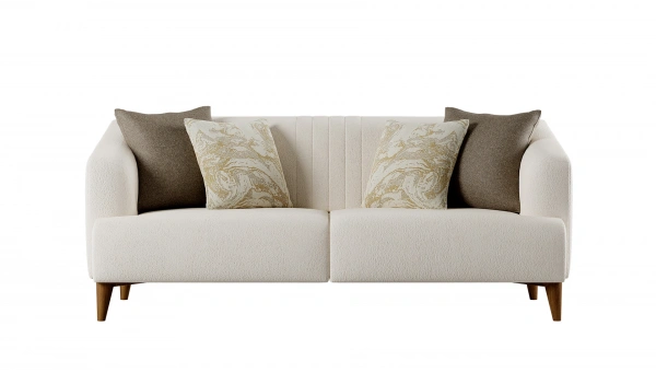
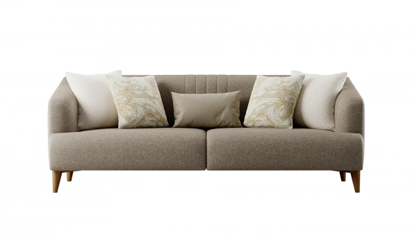
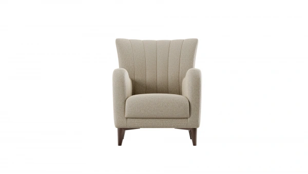
Neutral tones such as beige, cream, and light gray offer both warmth and a sense of balance. These colors are easy to combine and do not create a feeling of boredom over time.
You can create continuity by using these peaceful tones in various areas, from textiles to wall color, rugs to bedspreads. Even small touches can make a big difference.
How Should Vibrant Colors Be Used in the Bedroom?
Vibrant colors provide energy and dynamism, but using these tones in the right proportion in a resting area like the bedroom is very important. Otherwise, instead of creating a peaceful area, you may end up with a space that strains the eyes and reduces sleep quality.
Warm and vibrant colors such as red, orange, and bright yellow should not be used directly on large surfaces. Instead, choosing these tones in decorative details like pillows, frames, and lamps creates a more balanced appearance.
Striking colors like fuchsia, turquoise, or mustard don't create an unbalanced effect when placed on a neutral base while adding energy to the room. In this way, a dynamic style is reflected without compromising peace.
Another important factor when using vibrant tones is lighting. In rooms without natural light, the use of too many bright colors can make the space stifling. Vibrant colors used with soft lighting can add movement and warmth to the environment.
Finally, it is important to remember that the color harmony in double bedrooms should appeal to both individuals' sense of mood. Since vibrant colors can trigger different emotions, a common balance should be sought when making a choice.
What Is the Relationship Between Lighting and Color Selection?
The effect of the colors used in the bedroom is not only dependent on their tones but also on how those colors are illuminated. Because each color creates a different perception under various lighting conditions. Therefore, when choosing paint, attention should be paid not only to the catalog color but also to how it looks under light.
In a naturally lit bedroom, light tones appear brighter and more spacious, but in artificial light, these tones may give pale or yellowish reflections. Similarly, dark colors provide a deep and sophisticated appearance in daylight but can create a stifling atmosphere in poorly lit rooms. Therefore, the type of lighting must be taken into account in color selection.
Warm light sources (e.g., yellow-toned LED bulbs) provide a soft transition to warm colors like beige, cream, and pastel pink. This combination creates a relaxing atmosphere, especially in resting areas. Cold lights (white LED) show cool tones like gray and blue more clearly, but when overused, they can cool the spirit of the environment.
To fully experience the psychological effect of colors, it is helpful to test how the chosen wall paint looks at different times of the day. In this way, the harmony of colors with the space can be better understood both in daylight and under dim lighting at night.
What Are the Effects of Colors on Sleep Quality?
Colors can affect sleep quality without being noticed. Research has shown that the tones used in the environment affect brain waves, melatonin secretion, and stress levels. Therefore, colors preferred in bedroom decoration should be consciously chosen.
Cool tones such as blue and green relax the body, slow the heart rate, and facilitate the transition to deep sleep. Longer and uninterrupted sleep can be achieved in rooms decorated in these colors. At the same time, these tones also support waking up more refreshed in the mornings.
Dark tones, while adding sophistication to the environment, can create a depressive mood if overused. Especially colors like black, dark gray, or navy should only be used in details or balanced with light tones.
Stimulating colors like red and orange generate energy signals in the brain. This can negatively affect sleep quality. When used extensively in the bedroom, these colors can make it harder to fall asleep.
The effect of colors on sleep may vary for individuals. However, bedrooms using calming tones generally support mental relaxation and contribute to a healthier sleep pattern.
What Are Common Mistakes When Choosing Colors in the Bedroom?
Bedroom decoration involves some common mistakes in color selection that can make it difficult to create the desired atmosphere. Here are important points to avoid these mistakes:
- Selecting solely based on trends: Popular colors may not always be suitable for personal sleep habits or moods.
- Using too many dark tones: Deep colors can make the room's atmosphere heavy and create a suffocating effect, especially in spaces without natural light.
- Painting all walls the same vibrant color: Vibrant colors can be effective in small details, but when used on all surfaces, they can become stimulating.
- Ignoring lighting conditions: Colors look different under various lighting. It is essential to test how the chosen tone appears in daylight and under dim light in the evening.
- Not considering the harmony with furniture and textiles: Colors are not limited to walls only; they should also harmonize with complementary parts like curtains, rugs, and bedspreads.
By avoiding these mistakes, it is possible to create a bedroom atmosphere that is both visually balanced and psychologically supportive.