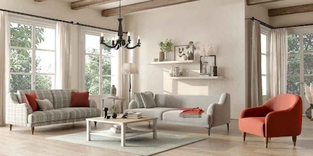
The living room is the social center of the home; a space for hosting guests, relaxing, and socializing. Pastel colors make these environments appear softer, more peaceful, and spacious. When the right tone balance is achieved with the combination of furniture, wall color, rug, and accessory choices, a tranquil and warm atmosphere is created in your living room. The lighting arrangement also reveals the true beauty of pastel tones. Here are guiding suggestions to masterfully use pastel colors in the living room:
What is the Effect of Pastel Colors on Living Room Decoration?
Pastel colors, with tones like grayish blue, pale pink, lavender, and soft mint green, give a sense of calmness and tranquility. Psychologically, these colors reduce eye strain and allow more light to diffuse into the interior. Especially in small living rooms or rooms lacking natural light, using pastel-toned paint on walls makes the space feel larger and more open.
For furniture selection, using pastel-colored fabric can serve as the main emphasis in the space. For example, adding dark brown wooden side tables around a light gray or soft blue sofa set can provide balance. Additionally, pastel tones make furniture appear simpler, giving decorative objects and accessories the opportunity to stand out.
Lighting is critical for these colors to "come alive." If natural light is used effectively, the reflection of pastel wall colors adds warmth to the space. In the evenings, using yellow-toned or warm white bulbs highlights details like cream and powder tones of pastel colors.
Pastel colors offer not only aesthetics but also emotional relaxation. These tones calm your mind after a stressful day and help create an emotional connection with the space. Especially colors like lavender, mint green, and light yellow enhance the sense of tranquility; this soft effect can be reinforced with decorative objects. Thus, your living room becomes not only stylish but also a rejuvenating living area.
How to Use Pastel Tones in Choosing a Seating Group?
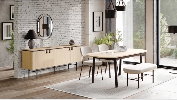
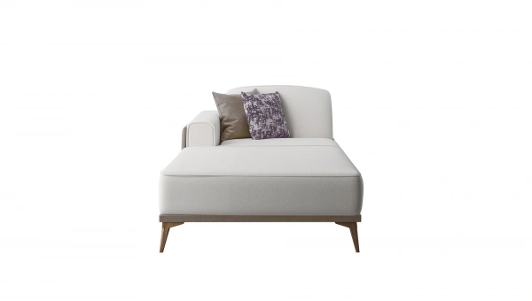
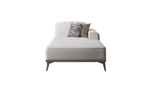
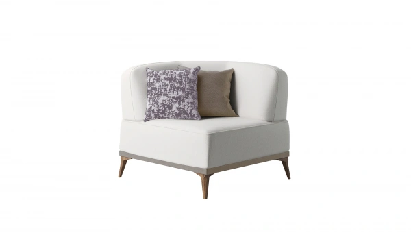
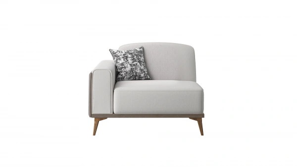
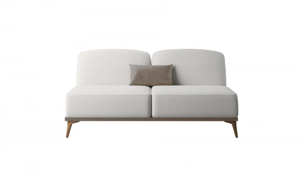
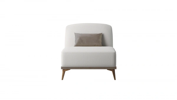
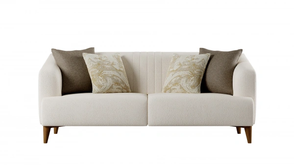
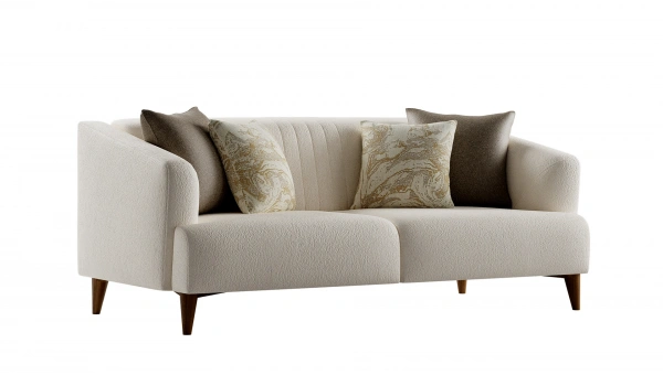
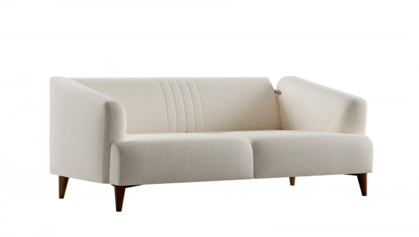
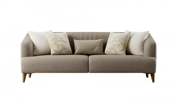
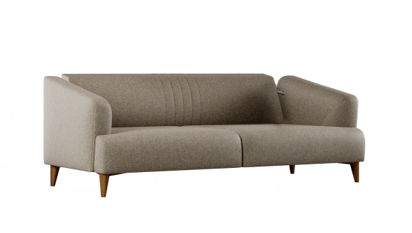
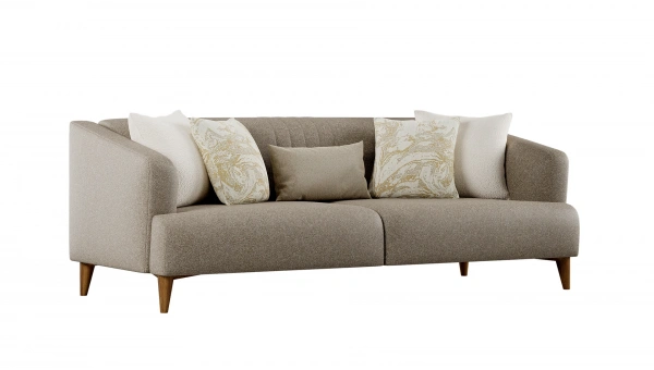
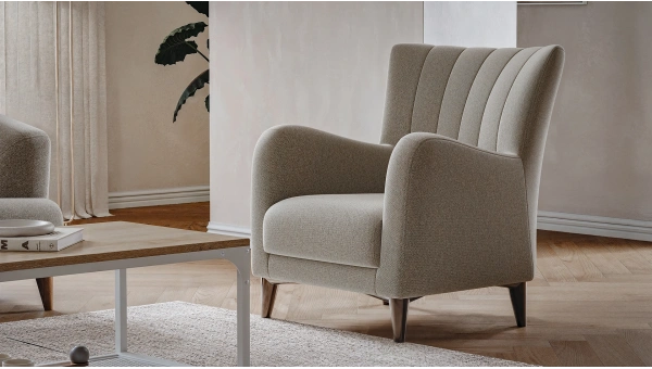
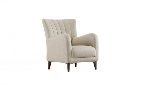
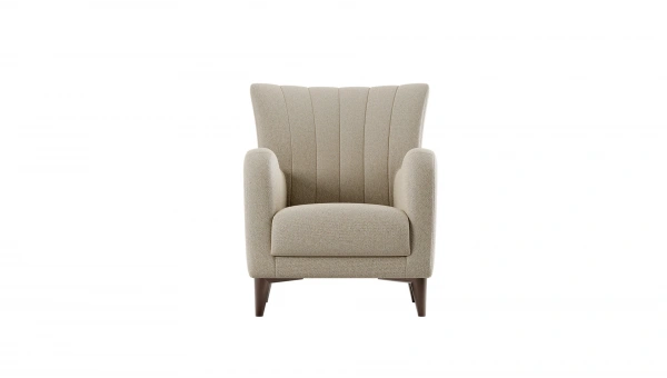
Sofa set is the focal point of the living room; hence, the harmony of pastel color tones with the furniture is crucial.
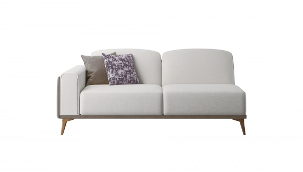
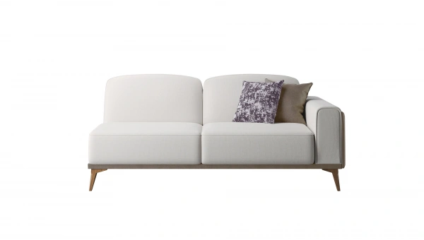
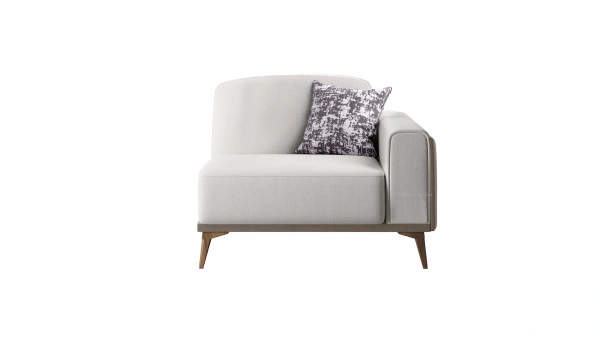
In pastel-colored sofa sets, fabrics in soft pink, gray-toned blue, or light lavender are commonly preferred. The fabric texture also affects the appearance of the tone; velvet or linen fabrics make pastel tones appear warmer and richer, while matte-textured fabrics offer a simpler effect.
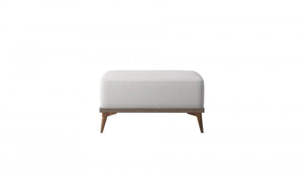
Wooden or metal details in the furniture framework should be balanced with pastel colors. For example, light oak colors can be used on the legs of a mint green sofa set. Cushion color transitions can be used on a bench or sectional sofa set to combine pastel tones.
Different saturations of pastel tones can be used to soften the transition between the sofa set and rugs, curtains, and decorative covers. Extremely bright or saturated colors should be avoided; tones with low saturation maintain the calming spirit of the space.
How to Balance Wall Color and Lighting with Pastel Colors?
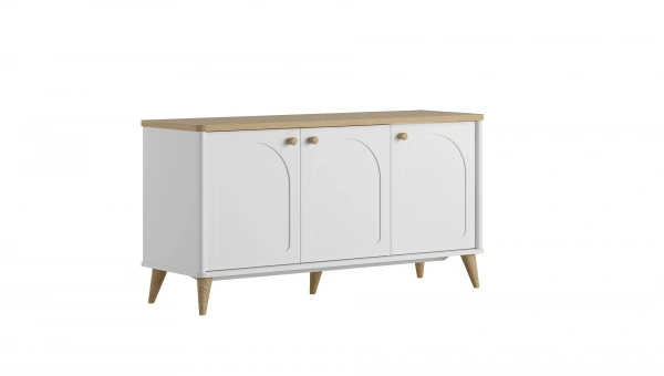
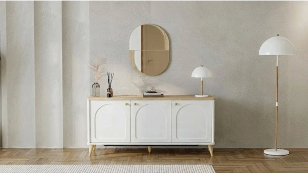
Wall color makes a substantial impact when chosen in pastel tones as it covers a large area in living room decoration. Light gray-beige tones or cream-powder colors are ideal starting points for walls. These tones provide harmony even if they do not resemble the pastel tone of large furniture like the sofa set.
For
lighting, it is important that the light from the ceiling is shadowless. Pendant lighting or recessed spotlights should be positioned to spread the ceiling light evenly. Additionally, creating dim areas beside the seating group with floor lamps or table lamps adds different layers and depth to the living room.
Curtain and rug selections should also be considered along with wall-light sensitivity. Light-colored curtains let light through, while lightly patterned rugs add movement to the uniform pastel ground of the space. When choosing patterns, minimal motifs should be preferred without overdoing it.
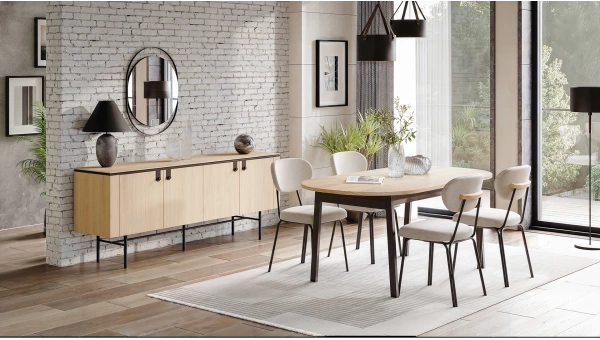
Which Pastel Tones Stand Out in Decorative Objects and Textile Products?
Among pastel color tones, those that particularly stand out in decorative objects and textile products are:
- Powder pink: provides a romantic touch on cushion covers, decorative boxes, and small frames.
- Soft mint green: adds freshness to the space on poufs, benches, or chair cushions.
- Lavender: exudes calmness and elegance in pastel curtains, textile covers, or painting details.
- Cream beige tones: form a balancing base on large surfaces like rugs and curtains.
- Pale gray: highlights furniture (especially the seating group) without overshadowing it; easily matches with decorative objects and accessories.
These pastel tones create small but effective highlights in the space through decorative objects and textile products, taking the living room decoration to the next level. When natural and soft combinations with low color saturation are chosen, the living room appears more peaceful and aesthetic.
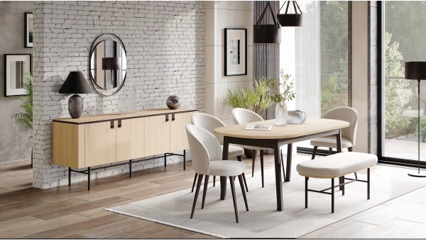
How to Choose Rugs and Curtains Compatible with Pastel Colors?
The effect of pastel colors is completed when the right rugs and curtains are selected, achieving unity in living room decoration. For
rug selection, light tones like cream, beige, pale gray, or pastel blue should be opted for. Patterned rugs should be decorated with minimal motifs, and tone-on-tone transition patterns should be chosen instead of contrasting colors to add movement without disturbing the peace.
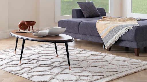
For curtain fabric, light linen or cotton fabrics in pastel colors are preferred; curtains that filter but do not darken the light keep the living room both bright and create a sense of warmth. Long curtains reaching the floor length make the space look more magnificent and spacious.
An ideal balance between furniture color and curtains or rugs is achieved with soft contrasts. If the seating group is pastel blue, the rug can be cream and the curtains pale gray; this color palette can be supported with bench or chair accessories.
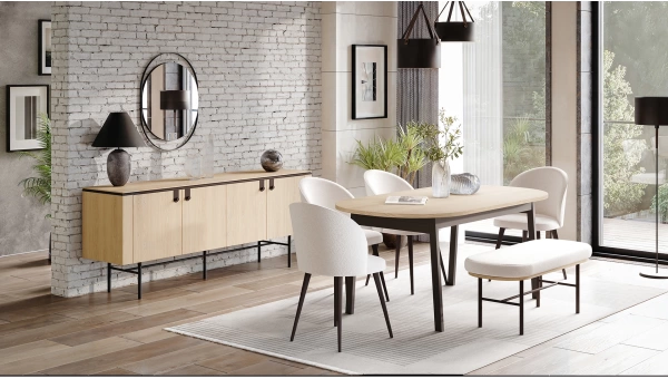
Common Mistakes: What to Consider When Using Pastel Colors in Living Rooms?
One common mistake when using pastel colors is choosing tones that are too pale, making the space appear cold or lifeless. If similar pastel tones are used together in walls, furniture, and textile products, warm color highlights or lighting with contrasts should be added.
The overall light arrangement should not be ignored either. Harsh white lights can make pastel tones appear washed out or dull. Therefore, warm light between yellow-white or adjustable dimmers should be preferred.
When selecting furniture, not only "appearance" but also functionality should be considered. For example, even if the seating group looks very comfortable, the comfort and supportiveness of seating elements like chairs or benches should be checked.
Lastly, an abundance of decorative objects can clutter the space. Decoration with pastel colors should remain simple; it should be completed with small accents and minimal objects. Instead of excessive objects, a few beautiful ones will keep the space balanced and aesthetic.